
(Click on the flow map to see the larger version on Wikipedia)
This flow map was recently touted by Dr. James Grime on Numberphile as “The Greatest Ever Infographic”. It’s created by Charles Minard, a French civil engineer and a pioneer for “information graphics”.
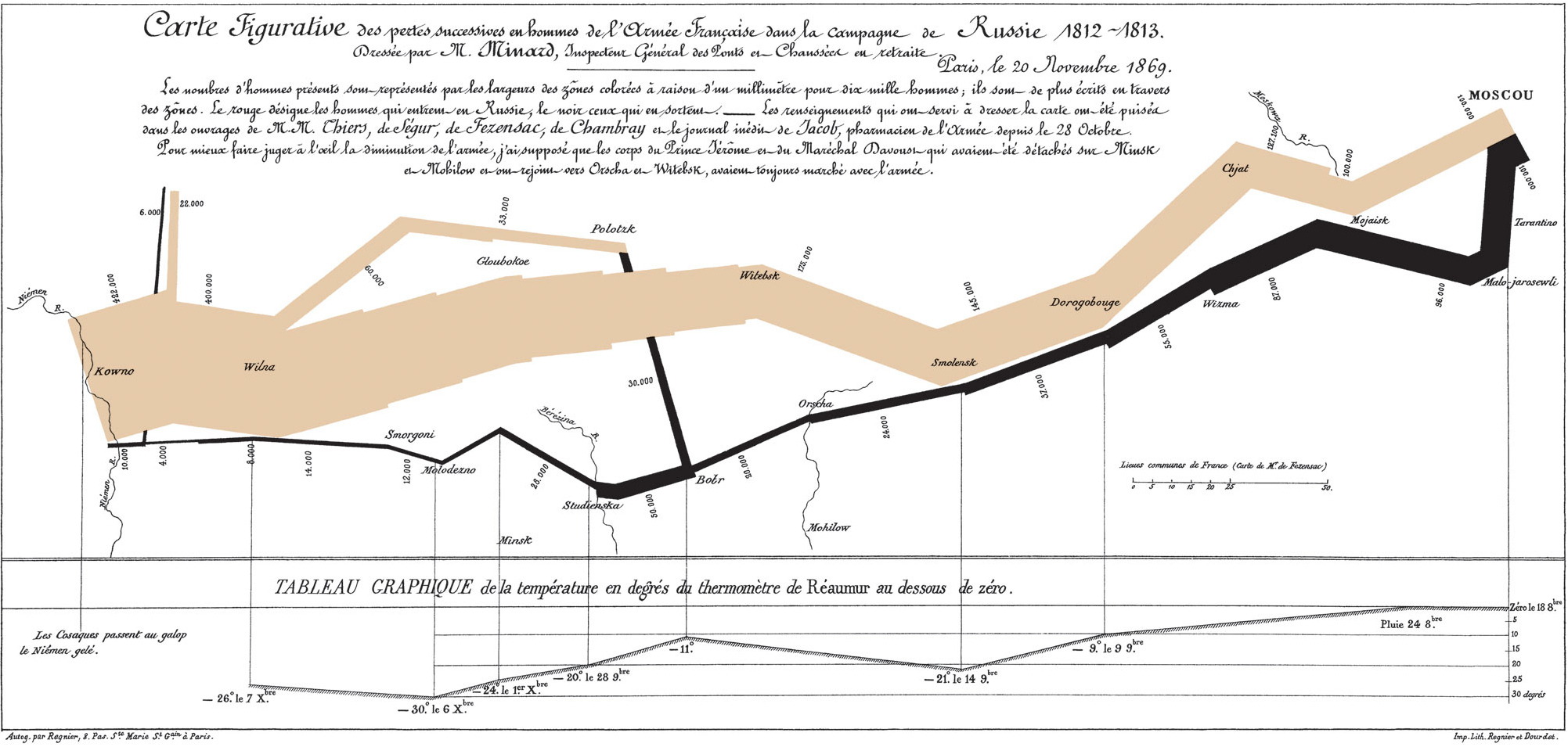
So, yes, Internet, I was just as startled as you’re now to realize that Information Graphics are not new, and that they used to actually demonstrate useful information and sometimes even tell a gripping story, such as this masterpiece published by Minard in 1869, depicting, in its chilling reality, in graphs nonetheless, Napoleon’s 1812 disastrous March through Russia to Moscow.
All you really need to know to appreciate the totality of Napoleon’s defeat and the enormity of suffering and loss is that the width of the beige colored band represents the size of Napoleon’s army on their way to Russia (442,000); the width of the black colored band, that of his army retreating after Moscow (10,000).
Dr. Grime spoke with great compassion of the point on the flow map where a second black-colored band joins the main one. It tells the story of the Battle of Bérézina, spanning four days in November 1812. The retreating French Army suffered unspeakable loss – the number goes from 50,000 before the Bérézina River to 28,000 afterwards.
I’d never shed a tear looking at a graph. Until I saw this one.
…defy the pen of the historian by its brutal eloquence. — Étienne-Jules Marey