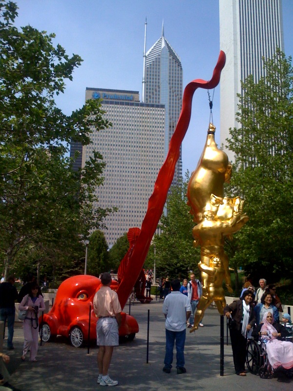
Valiant Struggle No 11, originally uploaded by The Absence of Alternatives.
This piece is part of the Public Art exhibit in Chicago: “A Conversation with Chicago: Contemporary Sculptures from China“.
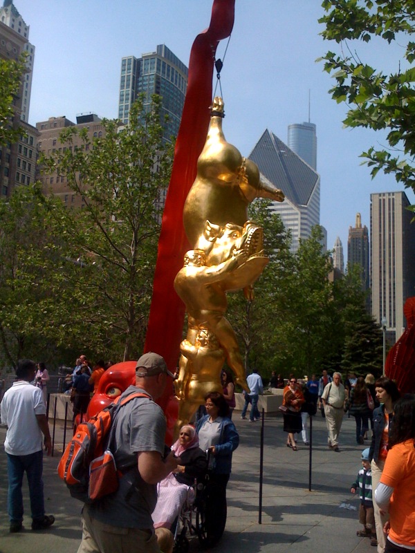
Valiant Struggle No. 11 by Chen Wenlin
I like “Protest Art”, or art with a message, as much as the next socially conscious and politically aware person. But can we say “Didactic”, let’s just call a spade a spade, eh?
Chen’s other sculptures, including the original piece with the same name, do not seem as “hitting you on the head with a giant hammer”… Perhaps the choice of red and gold was pushing it a bit too over the top?…
p.s. Is it just me? I had no desire whatsoever to get my own pictures taken with this sculpture. It would be like having your picture taken with a lecture that’s written with you in mind… Am I the only one that is reading the irony in this situation?
Or maybe the use the chosen colors was very intentional. Sometimes Americans need to be hit over the head with a hammer, or shocked into a reaction.
Interesting. I find his art to be grotesque, and thought provoking because of it. One would wonder what the significance of each object he employs would be.
I agree with you about the colors. Never been a fan of the combination. I found this site http://hubpages.com/hub/The-significance-of-the-colors-red–gold-in-Chinese-culture explaining the meaning of the colors red and gold in chinese culture. It would be interesting if the artist was conscious about it as he created this what can I say… hideous piece of creation.
.-= Yuko (emma_zero)´s last blog ..3. Beautiful Nation in the Shadow of Noble Principles =-.
I wonder whether the artist somehow felt “pressured” to be “more Chinese” for this piece specifically created with this “cultural exchange b/w Chicago and China” in mind, and as a result, he decided to use red and gold. The original piece uses pastel colors, and for me, that is not only visually more palatable, it also tones down the message of “look at how materialism turns us all into pigs”. I just had such a visceral reaction to the red & gold, “Look at this, it’s from China”, effect. And I am Chinese! The fact it’s outdoor and therefore extremely jarring probably didn’t help either…